
How to Write a Converting Call to Action: 7 Strategies to Follow
By Sam Nguyen

Drive 20-40% of your revenue with Avada
Does this sound similar? You ask someone to do something, and actually, nothing happens.
Whether it is getting your younger brother to fetch you a glass of water or getting your site visitors to part with their email addresses, there is one thing you must have:
A strong CTA (call to action).
If you create a strong CTA, you can get people to do (almost) anything you want.
But how can you write a powerful CTA?
That’s what you will learn today. We will give you 7 actionable strategies for creating effective CTAs. Let’s explore!
What is a call to action?
A call to action (CTA) is actually a word, phrase, or short sentence that prompts the reader to take a specific action. CTAs are often placed in the form of a button in a prominent spot on websites, like this:
With the right CTA, you can persuade people who visit your website or read your content to do a specific action, such as:
- Sign up for newsletters
- Grab a download
- Buy a product
- Share a piece of content on social media
- Read the rest of an article
And many more.
But it’s essential to remember that not all CTAs are created equally. Some are strong, powerful, and persuasive. Others are boring, weak, and uninviting.
In a moment, we will get into how to create a perfect CTA for your website and content. Before that, though, let’s take a look at 5 common types of CTAs and where you can use them.
5 common types of CTAs
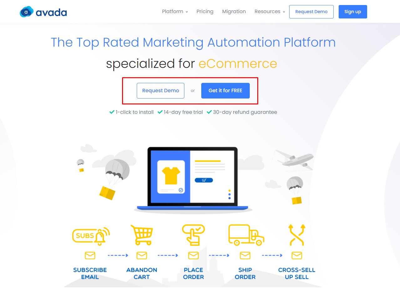
1. Web page buttons
This is one of the most popular placements for a CTA. If you have ever been to a webpage, you’ve seen them before. Actually, we have already seen one in the previous section.
CTA page buttons are usually large and stand apart from the rest of the page. Also, the button is easy to click. This is particularly helpful for mobile users that navigate your webpage with their fingers (not a mouse cursor).
2. Opt-in campaign buttons
When you show an opt-in campaign (such as a popup, floating bar, slide-in box, and so on), your copy will be incredibly critical. It needs to be short, catchy, as well as persuasive.
Most importantly, it should lead to a powerful CTA button:

The CTA above was modified to show the offer in the button, “Send Me My Discount!” (20% off your next purchase). This really works because many of your visitors won’t take the time to read every word on your opt-in campaign. Instead, they will browse to the spots that catch their attention the most.
When their eyes land on the CTA button, they are tempted to click because they instantly see the benefit of doing so.
3. Anchor texts in blog posts
In most blog posts, you will see a CTA written out with a link embedded somewhere in the text. You may have noticed these in AVADA Commerce’s blog:
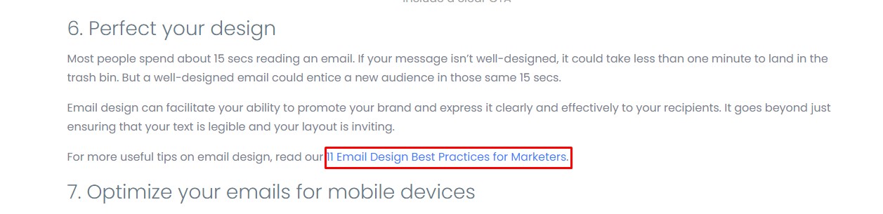
In the above image, the part in blue is a clickable link that redirects readers to another tutorial. But the entire sentence is the CTA.
In-text CTAs help improve user experience (UX). You can invite your readers to read related topics if they are confused about a concept, or follow you on social media.
4. Text in social media posts
If you use social media as a part of your marketing strategy, you know how vital a good CTA is.
You need to make the CTA in your social media posts clear, because other things will always be fighting for your readers’ attention on social platforms. Let’s see how Mageplaza does this:

The CTA is “Click on the link for more details!” That’s about as straightforward as it gets.
This helps readers better understand what the next step is to reach whatever problem you are helping them solve.
5. Buttons or text in emails
We see CTAs in emails every day when they ask us to:
- Download a resource
- Read the full article
- Take advantage of a discount or freebie
Let’s look at the email example from AVADA Commerce:
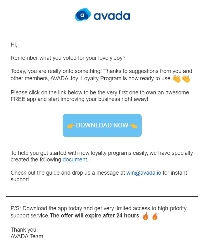
Notice that the color of the CTA is a huge contrast to the white background. That immediately draws your attention and makes the CTA impossible to miss.
Now that we have seen 5 common types of CTAs, let’s look at how to make them. In the next section, you’ll learn 7 strategies to write a converting CTA.
7 strategies to write a converting call to action
1. Define your goal
Before writing your CTA, you should clearly define the purpose of it.
What action do you really want people to take, and how do you get them to take it?
Now, let’s say you’re running an E-commerce store with clothing, and you want to email your subscribers with the purpose of boosting sales on a new line of shorts.
Here’s what most brands would do: Create an email with images of the new shorts and finish off with a button saying: “Shop Now.”
Does it work?
Well, not always!
So, here’s what you should do instead: You know what action you really want people to take, now you ask yourself how.
What value is your product/ service giving people that they cannot get elsewhere?
Take an example from Casper:
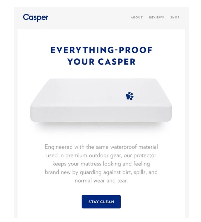
Casper understands a corner of its buyer persona is keeping bed sheets clean. The brand addresses this concern in the email copy, and instead of writing “Shop Now” in the CTA button, it chooses to write something that supports the CTA in the copy.
2. Use action words
It is all about being clear and concise with your CTA button. You don’t have a ton of space to get your point across, with the limit set at 35 characters per description line, so it’s essential to get straight to the point.
Let your readers understand exactly what you want them to do. You should start your CTA with the desired action. For instance:
- Run an E-commerce website? Start your CTA with “Buy,” “Order,” etc.
- Promote a newsletter or white paper? Try “Download,” “Subscribe,” etc.
- Want to request more information? Start your CTA with “Fill out a form for…” or “Find out how…”
Suppose you are a marketing agency, which is promoting your latest insights and tips. You want to make sure that your audience understands how to access that white paper.
If your CTA is something like “Our latest white paper is available,” you may not get a great CTR (click-through rate). Instead, a CTA such as “Download our white paper today!” is much more straightforward and informative, which should help improve CTR.
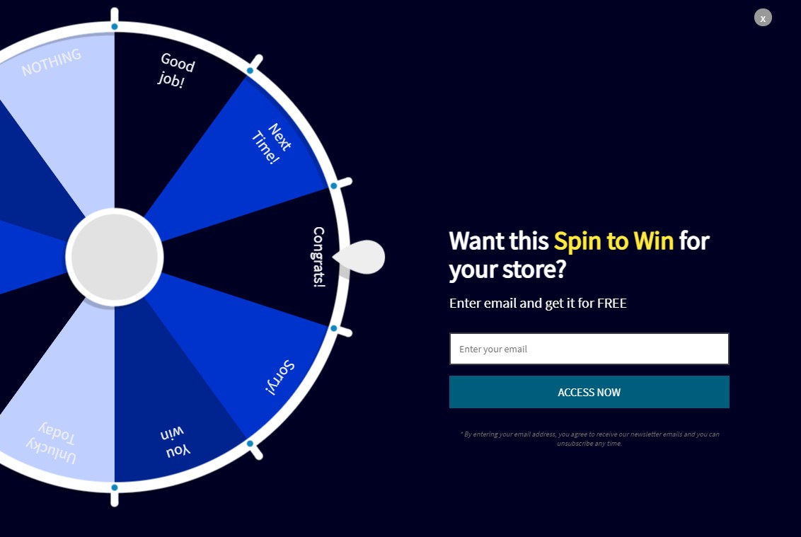
3. Foster curiosity and anticipation
A good CTA relies on psychology, combining curiosity with anticipation.
An excellent way of building curiosity is through gamification. If you turn your opt-in forms into a game, you are more likely to get people to click your CTA.
AVADA Commerce offers a Spin to Win opt-in that can be used to gamify any promotions you run:
4. Don’t hesitate to A/B test and get creative
As a matter of fact, A/B testing is an excellent way to identify which CTAs bring you clicks, and which ones bring you frowns. While your tried and true CTAs are always good to use, you never know how they will perform in your account until you actually use them.
The only way you can know for sure if something works for your account is if you test it out.
We recommend not only testing different CTAs, but also being creative with them. If your target audience doesn’t respond well to your CTA, you might as well try to think outside the box a little bit!
Let’s try:
- “Tons of deals right at your fingertips!” (this CTA is ideal for mobile)
- “A healthier life starts now!”
- “Don’t miss out! We’re just a phone call away”
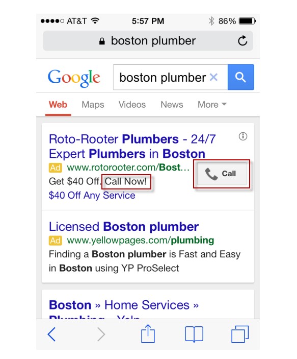
5. Know your devices
Creating a killer CTA is important, that’s no secret. But we also urge you to consider customizing your CTA based on the specific device being used by your audience.
Desktop and tablet are considered as the same device by Google, because the screen sizes are roughly the same, and people often use them for search in similar scenarios. However, mobile devices tend to target different user behavior and search intent.
People who search for something on their desktop/ tablet are often still doing their research, and are not quite ready to commit. But people searching for something on their mobile phones are often looking for fast results or “instant gratification.” This makes it prudent to tailor your CTA based on different devices.
Our advice is to create a more phone call-centric CTA that appears on mobile devices. You could try something like “Call us today for more information” or “Call now to get started.”
There are 2 common ways you can make this tactic even more effective:
-
Google lets you set a mobile preference for your ads, so you can designate specific ads to only appear for searches on mobile devices. With this option, you’re able to focus your CTA on generating more phone calls.
-
You can also enable call extensions to display your phone number alongside your ads. Google automatically adjusts the way your call extensions are shown on mobile searches. Typically, a small “Call” button will be displayed, allowing for one-touch dialing.
6. Use numbers when possible
Customers often respond well to numbers such as pricing, discounts, incentives, promotions, etc. It helps us determine whether or not it is worth splurging on items we desperately want. So, why not appeal to your target customers that way?
Consider experimenting with your pricing information in your CTA button, as well as any other applicable numerical information.
For example, a CTA such as “Shop today for lawn mowers under $200!” not only shows a user how little they’ll pay for a lawn mower, but it hits the FOMO element as well. If you’re running a special promotion for your spa, you could try something like “Book today! 15% off your next visit!”
7. Design your CTA buttons
Keep in mind that design is also an essential part of getting your CTA right.
But how can you make your CTA stand out? Let’s explore a few key CTA design elements:
- Use white space effectively
- Make sure that your CTA button contrasts with the colors on the rest of the page
- You can frame the button to create contrast, if necessary
- Pay attention to the button’s size because it needs to be large enough to click but not overwhelming
- Optimize your CTA button for mobile
Again, we take an example from AVADA Commerce:
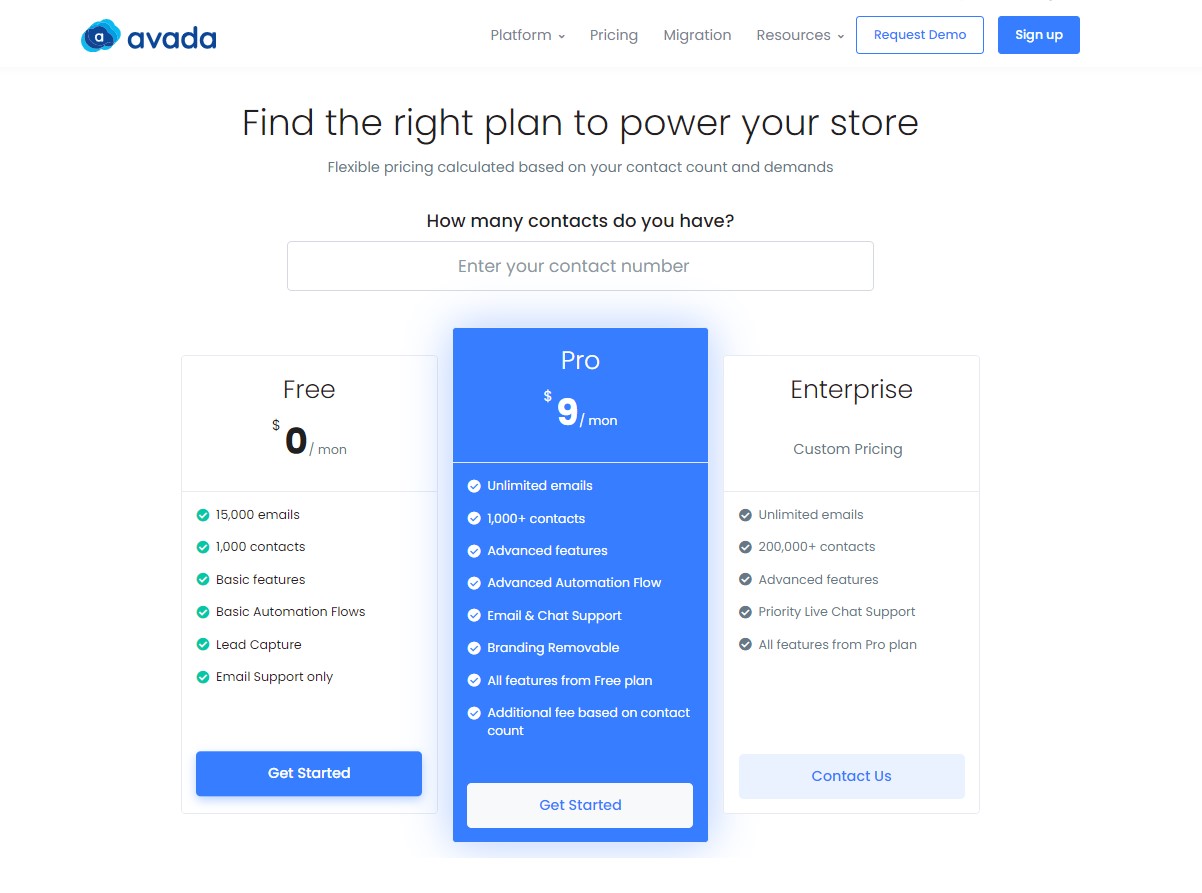
Notice that in the above image, 2 things are happening:
- Each pricing plan has its own CTA button (to stay organized)
- Each CTA button stands out from the background
The bottom line
That’s it for the guide on how to write a converting call to action. We hope with this blog post, you can see dramatic increases in conversions and sales.
So, do you have a preferred CTA, or perhaps one that surprised you with how well it did? What about one that you were hoping to perform well but ended up bombing? We’d love to hear about it, so feel free to share it with us!
And thanks a lot for reading our blog post, among thousands, even millions of posts out there! Have a good day!


New Posts


How To Set Up Google Analytics 4 For Your BigCommerce Store
