
How to Use Images in Email Marketing
By Sam Nguyen

Drive 20-40% of your revenue with Avada
Images can be extremely effective communicators. They can elicit emotion, express a message, and tell an emotional tale… As a result, photos are essential to your digital marketing strategies.
Images evoke feelings in addition to beautifying the posts and emails. You can use them to strategically place readers, and visitors in those states of mind, urging them to take specific actions, such as downloading a content offer or buying one of your newest items. You can also use photographs to tell the story of your company.
Although images can be a driving force in digital marketing, you need to know how to use them effectively if you want to optimize their power. In this article, I will share with you everything you need to know to use images effectively in email marketing.
Benefits of using images in emails
Before we dive into how to use images in emails, let’s have a look at some benefits of including imagery in your emails.
Emails with images are easier to digest
To understand this more easily, let’s take a look at these two emails:
Email 1:

Email 2:

Which version would you prefer to read, the visual or the plain text? We’re betting on the first one. And science did back up our claim. According to studies, our brain is wired for visual content; images convey information 60,000 times faster than mere text. This occurs because visual stimuli are the natural stimuli for our brain to begin processing information. Email marketing functions in the same way. A picture or other visual in an email allows us to process information faster and assess its meaning more easily.
Images in emails improve brand recognition
When Google bought YouTube, it also rebranded all of YouTube’s email marketing strategies to match Google’s brand. Images in Google’s and YouTube’s new marketing emails have a similar look and style:

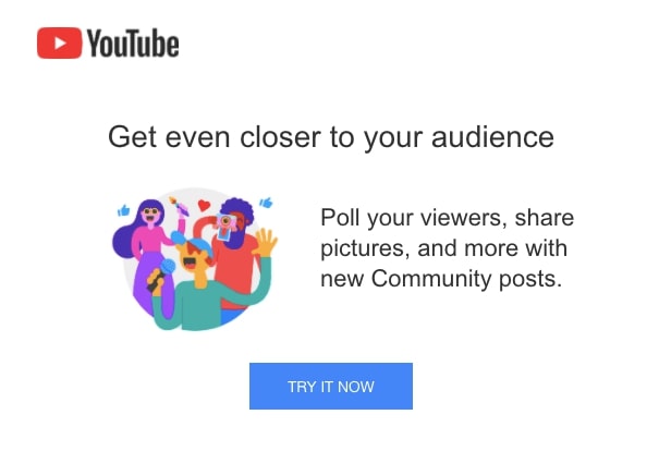
In these examples, you can see how Google applies the same approach to the font and visuals in YouTube’s emails, thus strengthening its brand as a Google property.
Such a strategy helps to make the brand’s online presence more reliable, which can boost your sales by up to 33% and greatly enhance your brand awareness.
Visuals in emails improve engagement rates
A marketing email’s primary aim is to maximize click-through rates and conversions. Can a plain text email accomplish these objectives? If you return to our visual vs. plain text example, you can see that an easy-to-digest copy is also more engaging than compressed and unreadable text.
According to HubSpot’s 2020 study, over 20% of surveyed marketers believe that proper brand-oriented email design dramatically improves email interaction. So, while email images did not work for Impact BND, they do for many other brands, especially B2C companies that rely heavily on visuals to promote their products through email marketing.
Types of images for email marketing
When it comes to the types of photos you can use in your marketing newsletters, the sky’s the limit. But first, let’s look at a few examples that you might find inspiring and appropriate for your email marketing campaign, as well as some photos of email examples.
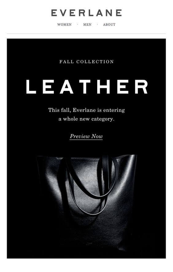
Black and white images
This form of imagery may not be your first option for email marketing because you may be tempted to use anything more colorful. However, black and white picture design will help you accomplish a specific goal because it has a few major advantages:
- It removes all distractions. Although each feature in a colored photograph normally draws attention to itself, resulting in blurred vision, the black and white design aids perception of the image as a whole. As a consequence, the message is more clearly communicated.
- Monochromatic imagery creates a certain emotion. The black and white style will make your email appear more intense depending on the mood.
- Subtle tones encourage minimalism. Since it is minimal and subtle, the black and white style is ideal for focusing your marketing email on a specific message.
You can see all these three benefits in action in this email from Everlane:
GIFs
This form of imagery has long been a common addition to emails. Many brands have used GIFs to construct their email marketing campaigns, and they were right to do so. Indeed, seeing an email with a GIF immediately engages you and puts you in a good mood. Take a look at this Chubbies marketing email:
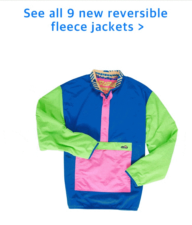
A GIF, when combined with the right post, can be a powerful marketing tool, as shown by the example above. But what is it about GIFs that people find so appealing?
According to Sage Journals study, people like GIFs because they build a so-called “networked effect,” which means that a GIF initiates a fast interaction between a brand and a customer. You already know how much consumers enjoy being a part of a brand.
GIFs, on the other hand, are not common and do not work with every marketing email. As a result, ensure that the photos in your email are relevant to the message’s intent.
Banners
When a brand needs to inform a customer of an upcoming deal or other sales-related news, it often chooses banners over other email photos.
Banners are an excellent option for such purposes because they draw attention to the promotion that you are attempting to sell. The following email example demonstrates how it works:

Banners, on the other hand, are effective not only for promotions but also for company newsletters and other notification-type emails. Banners may be used to highlight a company logo, a related picture, or the message itself in this case.
3D Images
Using 3D images in your marketing emails is a perfect way to diversify the imagery. They are, of course, 2D photos, but the 3D effect is achieved by a particular combination of a single-color background and the dynamics of other elements in the image. In Hulu’s email, you can see how it works:

As you can see, the black background creates a strong contrast with the photo’s red, grey, and white to create a 3D effect. You may also use 3D images in email to illustrate and highlight a product’s key features. Using a white background so that other items in the picture do not interfere with it.
Infographics
This type of email marketing picture is appropriate if your goal is to inform your customers about something that normally includes numbers. It may be the outcome of a survey, poll, or performance review, for example. For example, in the email below, CloudApp uses an infographic to inform a customer about the performance of their cloud storage:

The use of infographics in your emails ensures a high level of results. People are about 30 times more likely to read infographics from top to bottom, according to Venngage, than plain text.
Users are interested in this form of material, as you can see, because it is educational and provides immediate value. As a result, it can be a useful addition to your marketing newsletters.
Background images
Background images in email do not convey a message, but they do complete the overall design concept. Such photos may be fluorescent or pastel — it doesn’t matter. However, since background photos are often cycled/repeated in emails, they do not have any specific ornament on them. And you never know when it will pause and restart in a user’s inbox.
8 Best Practices For Using Images in Email Marketing
1. Get Your Image-to-Text Ratio Right
If an email contains a large picture but little or no text, this is a major red flag. Since spammers try to avoid text scans by enclosing their text in a picture, this is a fast way to harm your deliverability.
Make sure that if you’re going to use graphics, you’re also going to use a lot of text. The vast majority of your message should be written in text form. Keep your photographs to a minimum and don’t rely on them to convey your message.
2. Keep your image size reasonable
Avoid image file formats with large file sizes, such as PNG. You want them to load as soon as possible because if your message takes too long to open, people will simply close it and move on, leaving your trendy campaign in the dust. Use JPG format to reduce file size and speed up image loading.
3. Realize Your Images Might Not Load
Everyone’s email client (Gmail, Outlook, etc) is different. Some of them will not load your photos, especially if you are sending cold campaigns. There isn’t anything you can do about it, so the good step is to prepare for it.
Image alt tags are the perfect way to do this. The alt tag of an image in the sense of email is the text that appears when the image fails to load (or, in some cases, when you hover your mouse over the image). You can tag your photos with a summary that explains what would be there if the picture had loaded.
For example, if you have a headshot in your email signature, a tag like “headshot” or “profile picture” or anything similar does not seem professional. If it is “Your Name > Portrait,” it will be more obvious that your smiling face was supposed to be there.
4. Place Your Images Effectively
Consider why you’re including each picture in your email. All should serve an objective and be strategically positioned to achieve that purpose. If you’re going to use your logo, don’t just throw it in there at random. Put it in a place where you’d expect to see a logo, like the top corner or your signature.
5. Make Use Of Stock Images
If you’re going to use stock photos in your email marketing campaign, make sure they’re royalty-free and suitable for commercial use. Failure to do so could result in a lawsuit and seriously damage your brand’s reputation.
When using photographs from free picture pages, be cautious since some of them do not guarantee that the image is from the copyright holder. And if you end up using a stolen picture in your email, there’s a risk it’ll land you in hot water, and claiming you got it from a free image site won’t cut it.
It’s also a good idea to search for pictures that are of high quality, aren’t fuzzy, and aren’t too cropped. Stock photos may also seem cliched, overexposed, and overused. To make the most of them, however, look for pictures that are original and not generic.
6. Pay Attention To Your Message
What are the messages conveyed by your image? You may think your hero picture is fantastic, but take three steps back and consider what it conveys. An image is worth a thousand words, and none of those words should be negative.
Is it clear that it’s a stock photo if it’s a stock photo? If that’s the feeling you’re looking for, you’re good to go. Using pictures with watermarks is a major no-no.
A watermark is a semi-transparent logo or text that is put on many stock images to discourage people from simply saving and using them without paying for them. A picture with a watermark is an automatic no-go for any email that lands in my inbox, since it comes off as extremely unprofessional.
Is the vibe of your vector or illustrated picture consistent with your company’s positioning and branding? Choose your images with care and consideration for the messages they will convey – not only to you, but to those who may view them differently.
7. Optimize Your Images For Different Devices
Not all of your subscribers will open your email on the same device. They may use a laptop, email client, and web browser. Furthermore, the images you use can appear differently on each type of screen. That is why you must test your emails before sending them to ensure that your images display correctly on all devices. Send emails to coworkers or friends to solicit input. Before sending the email to real customers, double-check it on various devices to ensure it works properly.
8. Make sure your images are relevant
This should go without saying, but be certain that the photos you use are relevant to the content of your email. Rather than inserting anything out of the blue, ensure that the photos make sense and are contextually appropriate.
Final words
That’s it! I hope that this article has provided you with valuable information about Please feel free to leave comments below for further discussion on this topic!


New Posts


How To Set Up Google Analytics 4 For Your BigCommerce Store
