
Email Marketing Banner: Best Practices and Inspiring Examples
By Sam Nguyen

Drive 20-40% of your revenue with Avada
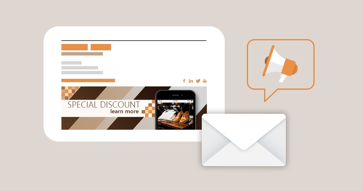
Email is the ideal way to notify your customers about discounts, promotions, and new products. It is the most direct method of communication, allowing businesses to create customized campaigns based on the interests of their subscribers. However, getting individuals to open your emails might be difficult. An eye-catching banner to pull people in might be really beneficial.
Banners can be used for everything from emphasizing a particular promotion to increasing brand recognition by including your logo and colors in each email. Email banner design is important, and building a reusable template is essential for establishing a look and feel to your emails without having to spend time re-generating them for each email you send. In this article, I will share with you some best practices for email marketing banners, as well as examples to inspire your next campaign. Let’s jump right into the details!
What is an email banner?

Let’s start with an explanation of what an email banner is. This is not to be mistaken with an email signature banner, which goes at the bottom of your email; this one goes at the top.
It is simply a graphic with some language that establishes the tone for your email. It might be a banner that you use on a regular basis to represent your company with only your brand name and logo, or it can be one-offs (almost like a little ad) that highlight an offer, such as a discount, loyalty program, or a welcome email for new subscribers.
What elements to include in your email banner design
Even though you can use your banners in a variety of ways, they should all include a few crucial elements to make your email stand out. The goal is for your readers to immediately link your emails with your business when they open them, therefore always include:
Brand name
If you’re attempting to raise brand recognition through all of your emails, your brand name should be prominent and take up the majority of the space.
If you’re using the banner to advertise anything exceptional, such as a new product or promotion, your name can be more inconspicuous on the email banner design, since you want your readers’ attention to be focused on the offer. But keep in mind that you still want people to be able to look quickly and recognize it as being from you, so include your brand name someplace.
Brand logo
By using your logo as your brand name, you can kill two birds with one stone. Then it’s readily recognizable and doesn’t feel overly repetitive.
Brand colors
Your email banners, like your website and advertisements, should have the same look and feel as your brand. It’s another method to represent your company, thus applying your colors consistently is critical.
That’s why Tiffany’s boxes, for example, are that same Robin’s egg blue, and they use it everywhere they can. At this point, you think of Tiffany’s the moment you see that color (even though it has nothing to do with their business). That is how strong a color can be.
You can always experiment with design and sizing, but keep in mind that you should always use comparable backdrop colors and adhere to your overall brand guidelines. You probably don’t want to be if your colors are turquoise and grey.
Product photos
Your banner, depending on its size, can be an excellent area to display a product photo or two. This is especially true if the email is about a brand-new product. Because the banner is the first thing your readers will see when they open your email, it is an excellent opportunity to capture their attention and hook them with information they require or desire.
Just keep in mind that the most crucial aspect of exhibiting your products is that they should be your own images (or photos taken by your customers!). In general, it is advisable to avoid using stock photos.
Link to your website
Check that your banner (as well as any other graphics in your email) connects to your business! You’re usually better off sending them to your collections page, which has all of your products, rather than your homepage, so they don’t have to click around to find what they’re searching for. However, if you’re showcasing a certain product, you might just want to direct them to the product page.
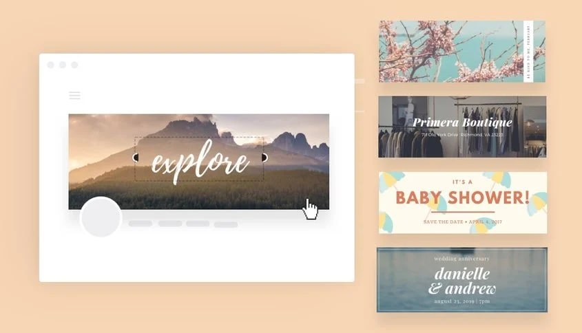
Another alternative is to include a menu-style choice in your banner, similar to what your visitors would see if they visited your website. As Lunya has done here:
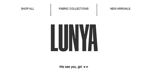
Simply keep it simple and clear so that readers can readily identify where they want to go.
Descriptive and enticing copy
Because email banners are visual, it’s not necessary to include a lot of prose, but if you have a great offer, make it evident to your subscribers. Keep it brief and to the point, such as “20% off site-wide.” Then, a bit farther down in the email, you can include more copy to truly catch them.
5 email banner design best practices
Your email banners are free space to boost brand recognition and entice readers to read the rest of your email (and hopefully proceed to your store to make a purchase). To make your work easier, it should be reusable while still being versatile enough that you can simply alter it if you want to customize it for anything specific, such as a holiday or a new product release. The simpler your banner, the easier this will be.
1. Showcase your brand clearly
Any photos you include, as well as the overall design, should reflect your personal style. Make use of your company’s colors, logo, and name. Consider your logo/name positioning when designing your banners, as this will ideally be in every email banner from now on, even if you change it up based on your campaigns.
2. Keep the email banner design simple
A simple design is much easier to experiment with. The last thing you want is to create the perfect email just to discover that customizing your banner will take forever. So don’t overcomplicate it by incorporating too many features. Keep in mind that this is only the beginning of your email. There’s plenty of room underneath for anything else.
3. Check your email banner size
It is best to keep your banner size consistent throughout all of your email campaigns. The size is up to you, but it shouldn’t take up too much space in your email. Depending on your menu, try to keep the height between 70px and 200px. Also, make sure it looks excellent on mobile devices!
4. Make your email banners reusable
You should have several templated versions that allow for personalization, but you should also have a handful that you can put in without thinking about it if you need to get an email out the door quickly. I mean, isn’t that how it always goes?
5. Customize banners by email campaign
Email banners are ideal real estate for any special offers, new items, best-sellers, and discounts, to name a few. Don’t pass up the opportunity to modify your banners based on the message you’re attempting to convey if you have reusable email header templates on hand. Adding language, photos or graphics, and promo codes are all ways to create banners for your various campaigns.
10 Amazing Email Banner Designs For Your Inspiration
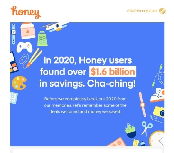
1. Honey: Right to the point and catchy
This email banner is not only wonderfully created with images in vibrant hues, but the call to action is also eye-catching and direct. It’s a promotional email, but it also instills a sense of generosity and community. Honey explicitly notifies subscribers in the header how much their peers saved by using its services, as well as the genuine value of being a part of that community.
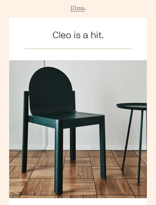
2. Dims: Eye-grabbing product shot
Selling one-of-a-kind, high-quality items? Because they are the star of your show, why not feature them on the hero image? Dims promotes the Cleo chair in this email, which merely shows the product in the headline with the message “Cleo is a hit.” The rest of the email is text with testimonials from happy customers.
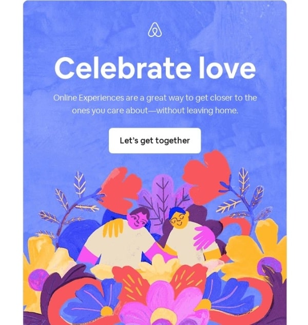
3. Airbnb: Quirky and artistic
This marketing banner has nothing overly promotional, but what makes it appealing is its distinct style and design. This email is a recipe for a great click-through rate, with a detailed illustration, lovely colors, and a caption that will convert even the toughest hearts into mush (Feel the love, even from afar).
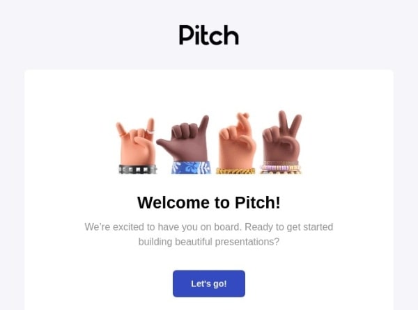
4. Pitch: High-quality design, high value
A decent presentation is critical for a company that sells presentation designs. Pitch designed a 3D realistic design for the hero image in their onboarding email that is adorable and quickly sells one of their major values: they stand for good design.
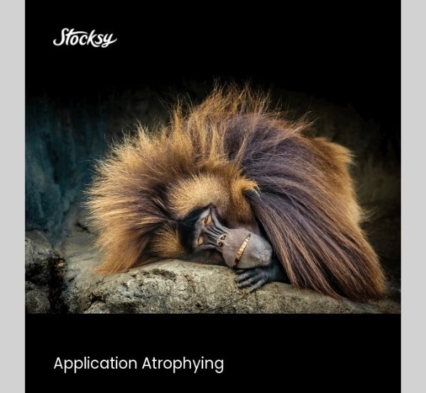
5. Stocksy: The power of humor
Stocksy used a hilarious photo of a rather lethargic monkey and the subject text “Application Atrophying” to remind their mid-funnel consumers to finish their application. Because Stocksy is a stock photo library, it’s very obvious that they used one of their items as a hero image while also advertising the high quality photos they have in their ranks.
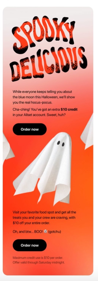
6. Allset: Typography
Allset employed a unique typographic art as the banner instead of images, stock photos, or videos. It may just be my personal choice because I enjoy typography, but it’s captivating and something I’d read through.
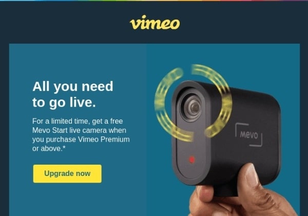
7. Vimeo: Limited offer for FOMO
A product photo of the limited-time deal, followed by an intriguing value proposition (All you need to go live), is enough to entice those who genuinely need the camera to stream videos to consider this email marketing offer.
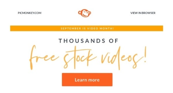
8. Picmonkey: Freebies always work
This is possibly the simplest heading of all the emails on this list, but it does have one “show-stopper”: a gratis offer. You can watch some of the free videos available by scrolling down, but the banner is enough to draw your attention.
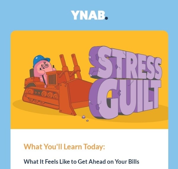
9. YNAB: Cartoons that put a smile on your face
A personal budgeting software that assists with financing and cost tracking appears to be pretty corporate, dare I say, boring marketing. However, using this cartoon-style header, they demonstrate how using their program might ease stress and guilt in the months ahead as a result of your improved saving ability.
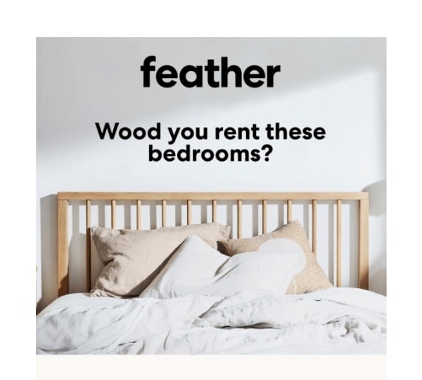
10. Feather: A Clever subject line
Finally, we have this email where Feather used a word play to emphasize the “wood” aspect of their furniture that may be hired. Punctual, but effective!
Email banner FAQs
How to create an email banner?
Create a banner template that you can reuse using a service like Canva or what is accessible through your ESP. Include your brand’s colors, name, and logo. Maintain a simple and distraction-free design.
Make sure you have enough area to incorporate promotional material when needed, or that you have a few templates that you can use for different email campaigns. Include things like product photographs and discount offers, and attempt to have a generic header design choice that you don’t have to customize if you need to send a message quickly.
What size should an email banner be?
Email banners should be between 70px and 200px in height, though whether you go square or rectangular is up to you and the aesthetic you want for your email.
Should I use images in my email banner?
Yes! It’s the ideal spot to highlight the things you’d like to offer or that you know your readers would want to buy. It’s also an opportunity to demonstrate genuine consumers utilizing your items or inspirational photographs that reflect the personality of your brand. Just make sure they aren’t stock images!
Are a header and a footer necessary?
Yes. The footer contains crucial corporate information such as your address and contact information, as well as unsubscribe options and social media icons. The heading will determine whether or not your readers read the rest of the email.
Final words
That’s it! I hope that this article has provided you with valuable information and tips about email marketing banners. Please feel free to leave comments below for further discussion on this topic!


New Posts


How To Set Up Google Analytics 4 For Your BigCommerce Store
