
18+ Killer Call To Action Examples in Email
By Sam Nguyen

Drive 20-40% of your revenue with Avada
It can be difficult to persuade prospective customers to do what you want them to do. They abandon their carts before checking out, they don’t subscribe to your beautifully written newsletter, and they don’t even read your sales emails all the way through.
There is, however, hope. All you have to do to get your prospects to do what you want is include a compelling call to action on your eCommerce website and in your email marketing campaigns. It all comes down to how you encourage your potential customers to perform the desired actions.
Learn More. Sign Up. Shop Now. Click Here. These common words for a call to action button won’t make them do anything, though.
If you want your emails to stand out in the readers’ crowded inboxes, you must create emails with calls-to-action (CTAs) that compel readers to act immediately. This is not an easy task.
Fortunately, there are so many different ways to implement an effective call-to-action on your site. In today’s article, I will show you 15+ best email call to action examples and explain why people just love to click on them. Do it right, and you will be able to break through the noise, drive a higher email engagement rate, generate more sales, etc.
What is an email call to action
In email marketing, a call to action is a brief, basic statement that normally appears at the bottom of the email. It should request that the reader take some action that advances the deal. It could be to schedule a meeting or sign up for regular updates. What matters is that they do something to keep subscribers engaged.
In truth, you could argue that the call to action in a sales email is the indicator for success. Because a sales email is only successful if the prospect follows through on the request made in the call to action. It challenges you to think about every single word in your email, resulting in stronger copy that motivates consumers to take action.
Many marketers consider a call to action (CTA) to be a single element in their content that can compel users to take action with a single phrase:
Download. Read more. Join now.
It’s not the case.
Your button or link is merely one aspect of the CTA - a crucial one - but it isn’t strong enough to stand on its own.
There are a few characteristics that all good sales email calls to action have in common:
-
They’re obvious.
-
They’re distinctive.
-
They request something from the reader.
-
They just have one request.
-
That is a simple request.
-
You have a strong reason to speak with the prospect again if they do the action.
18+ email call to action examples to learn from
If the goal of your email is to get a response to your call to action, the rest of the message should be written to encourage the prospect to take action. You must first determine the aim of your CTA before you begin creating it.
What action do you want others to take, and how will you persuade them to do it?
These next call to action examples in email from various companies and industries can help you answer that question. They have fantastic choices of words, relatable actions, and great designs that you can surely copy for your emails. See them and learn how to influence your audience through email calls to action.
1. Birchbox
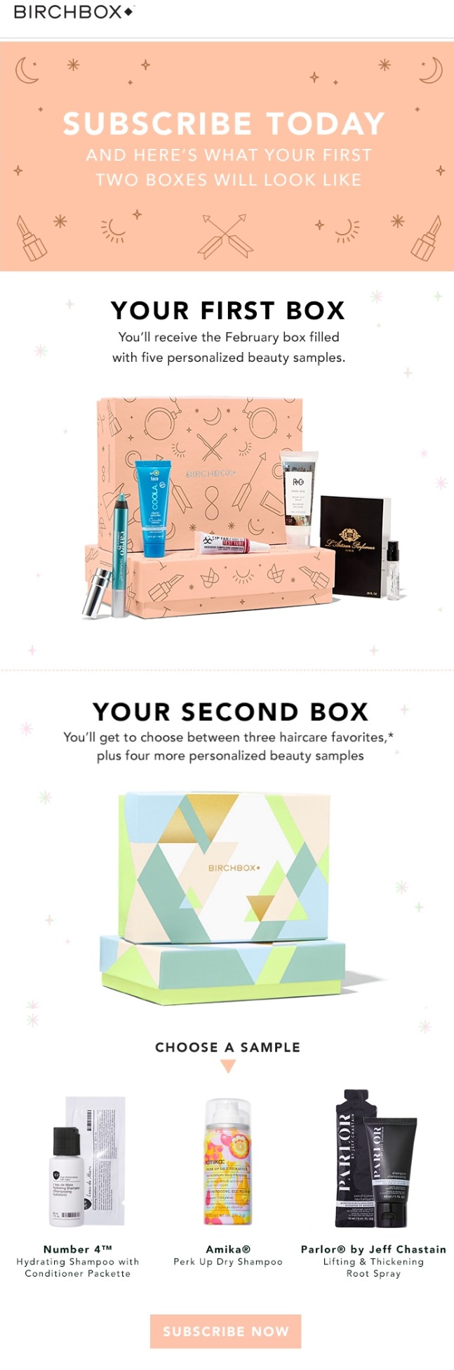
There is a lot of debate on the best place that you should place a call to action in an email. According to some email marketing gurus, your call to action should be “above the fold,” meaning that recipients should be able to view it without having to scroll down. Others argue that the best place for a call to action is at the bottom of an email.
Both of these are correct, so use your common sense to decide which is best for your email. A call to action above the email makes sense if a subscriber can instantly comprehend the aim of your email. If your offer necessitates further explanation, place the call to action at the bottom of the email.
Because the offer requires some explanation, the call to action in the example above from Birchbox is placed towards the end of the email. Also, the color design is just fantastic since the button has the same color as the first image and some product, making the whole email look seamless.
2. Emma
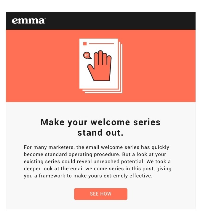
Your call to action should be succinct and direct. It’s worth noting that the majority of the calls to action on our master list are only 2-4 words long. This is what you should strive for in order to maintain the effectiveness of your call to action.
Here’s an example of an email from Emma that uses simple language to persuade consumers to behave naturally and easily. The curious will respond to Emma’s call to action, “See How.”
3. WeTransfer
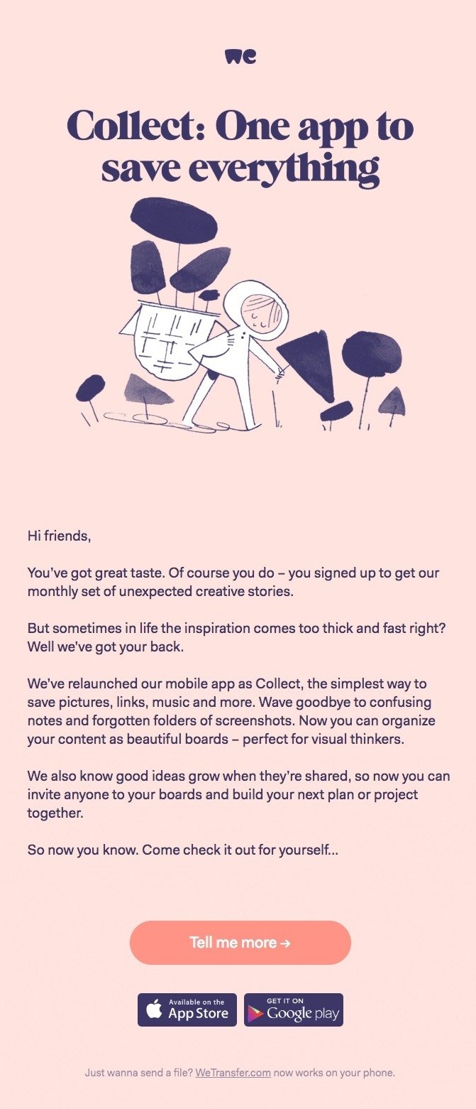
In the copy of more and more calls to action, the words “I” or “me” appear. In this list, you’ll see various examples of calls to action, such as “Yes!” “Count me in!” or “I want a free upgrade!” This type of phrasing makes a call to action more familiar to subscribers and encourages them to click.
The usage of terms like “me” in this example from the WeTransfer app sent the email straight to the inbox, thoroughly immersing the readers. Any reader will find it difficult to ignore language written in the first person. As a result, they are more likely to click through.
4. Casper
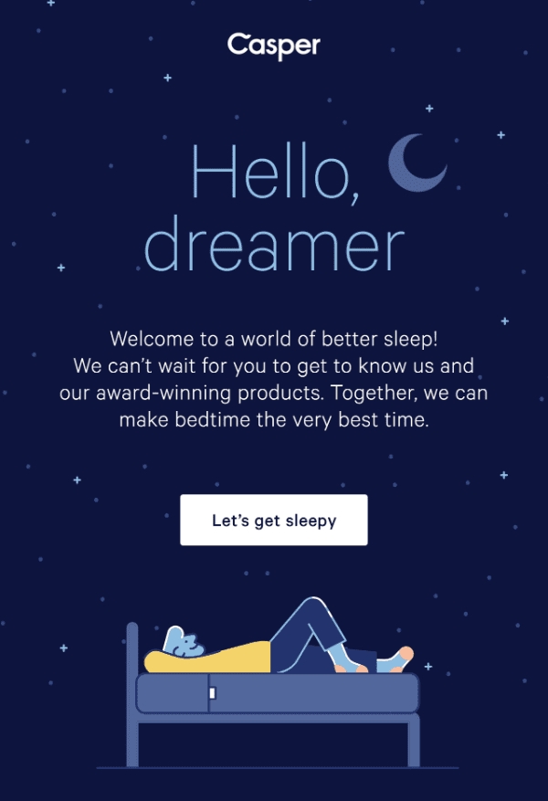
You know what action you want people to do, so the next step is to figure out how to get them to take it.
What value does your product provide that customers can’t acquire somewhere else?
Casper provides an example. Casper understands a concern of their buyer persona is to get better sleep with a comfortable mattress. They solve this issue in the email’s copy, and instead of stating “Shop Now” in the CTA button, they choose to write something in the email copy that supports the CTA.
“Let’s get sleepy” isn’t the most exciting words to hear, but as a CTA for Casper, this works amazingly well. The button not only shows the company’s humor but also lets readers know that they know the pain point of their buyers. Who wouldn’t want to click on that and get a good sleep?
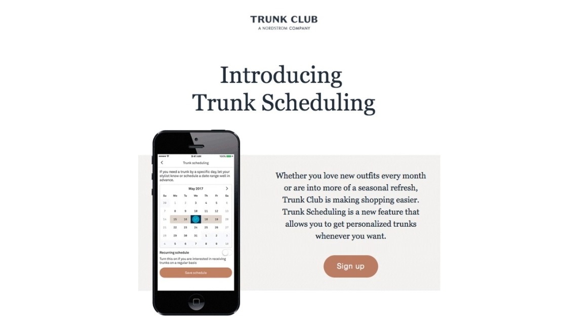
5. Trunk Club
Use different CTAs throughout your email. Change it up and use different CTAs to provoke different emotions.
Although the activity is the same, your approach is distinct.
You boost your chances of “hitting your readers’ sweet spots” and getting them to click by including many CTAs with the same aim but presented differently.
Take a look at the example above from Trunk Club:
They introduce their new feature and provide a CTA in the opening section of the email.
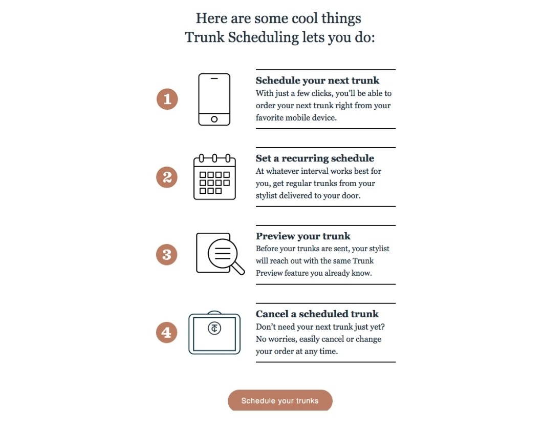
The email’s second section includes a more detailed description of the feature as well as a fresh call-to-action that serves the same objective as the first. Only the words are quite different this time with “Schedule your trunks”.
6. Beardbrand
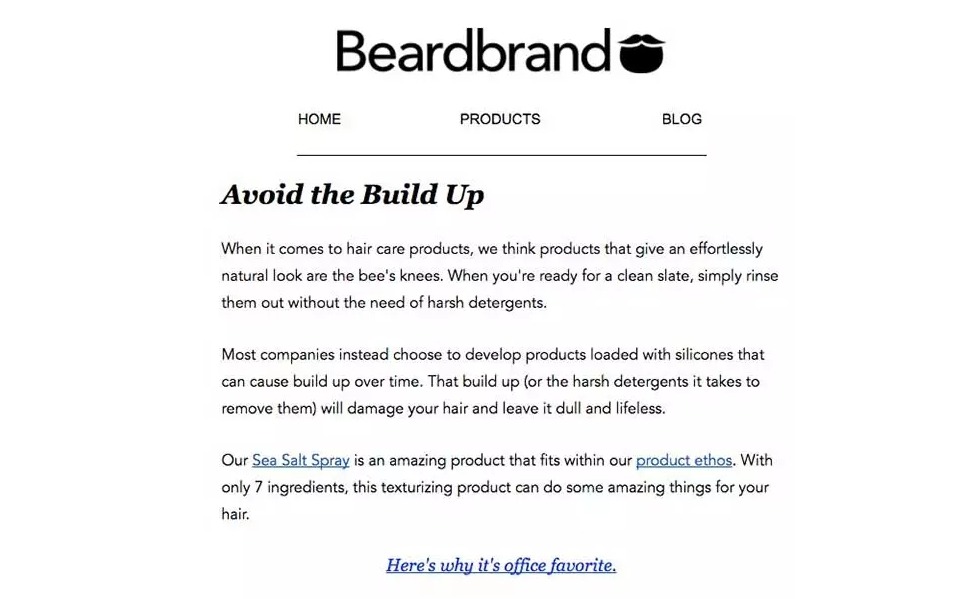
Using embedded commands in the copy as a CTA is another method. Few marketers use this, and the only way to know if it works for you is to put it to the test.
Embedded commands are in-text links, which means that instead of adding buttons, you link a section of a sentence.
By including embedded commands in the copy, you avoid interrupting the email’s flow and make it more legible.
The image above is an example from Beardbrand. There are not button to click, but you still get a clear idea of the message: “Try the Sea Salt Spray with these copy”
If you have a lot of text in your emails, use embedded copy; if you have a lot of visuals (product photographs, for example), buttons are more effective.
However, as I often recommend, you should test both options to discover which one works best for your emails.
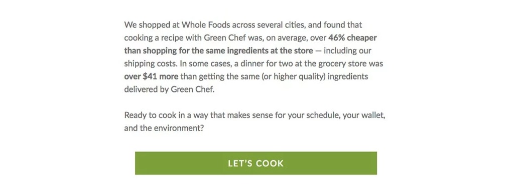
7. Green Chef
After you’ve perfected your CTA copy, there are a couple more things to think about before sending your email.
To begin, don’t ever include too many CTAs in an email. This isn’t to say that you can’t have several links and buttons; it just means that the objective of each one must be the same.
Take a look at the example from Green Chef. They begin by addressing a frequent pricing issue: organic food can be costly.
Green Chef understands that individuals may not read the full email, so they’ve included a call-to-action that allows customers to try their product for free (again addresses the customer’s concern over price).
They then overcome the price objection by persuading the reader that their product is less expensive than what can be found in ordinary food stores.
Green Chef still addresses the same issue, and despite the fact that the button is different, the goal remains the same: to get readers to try Green Chef.
8. De Beers
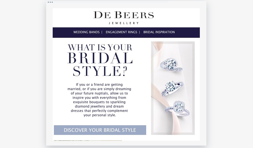
Make the email call to action a color that isn’t used, or only used sometimes, in the rest of the email to make it stand out. Take a look at De Beers’ email and notice how the call to action is written in a light blue color.
To have a better idea at color scheme, you can learn about monochromatic, analogous, and complementary color combinations. There are many free color scheme generators that you can find online to try them out. Who knows, maybe you will come up with some new colors for your brand as well.
9. Handy
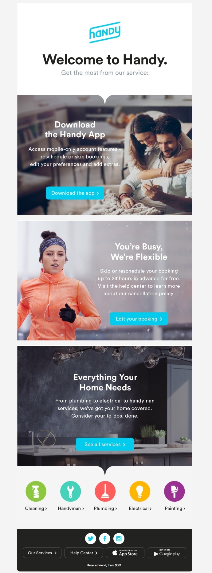
It’s vital to keep in mind that there are many different sorts of email formats and style options, all of which have an impact on where your CTA buttons appear.
The secondary CTA buttons should be clearly positioned with each segment if you have a mail with various themes going to distinct pieces of content.
Here’s a practical example from Handy. Their welcome email has several calls to action that are well-organized. You should begin at the top and work your way down the CTA buttons.
10. CamelCamelCamel
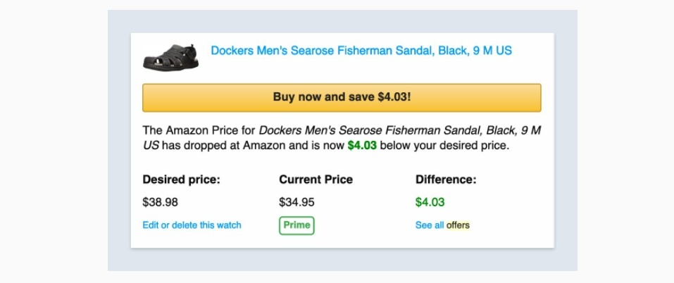
If you have a limited offer or your sales email is time-sensitive, take advantage of it with a strong call to action that creates a sense of urgency. People despise missing out, especially when it comes to limited-time e-commerce discounts! Use button text that informs your reader that they must act right away in order to reap the benefits.
While it’s simple to end your button text with the word “now,” try experimenting with terms that raise the stakes. “Experience it before your friends,” for example, or “Offer ends at 6:00 PM.”
CamelCamelCamel, an Amazon price tracker, employs a particularly huge CTA button to entice you to “buy now and save” before the price rises again. The button is created in a familiar form that encourages high click-through rates to Amazon’s product page.
11. Google

If your email is overly cluttered, the CTA will be difficult to see, no matter how bright or large it is. Consider the empty space in the email. To eliminate visual noise, make sure there is enough white space surrounding your button.
In their regular email newsletters, Google makes effective use of its basic style. The monotone logo and white space don’t compete for attention with the single CTA button in their typical material design style. It may appear simple to others, but it works in this situation.
12. Land’s End
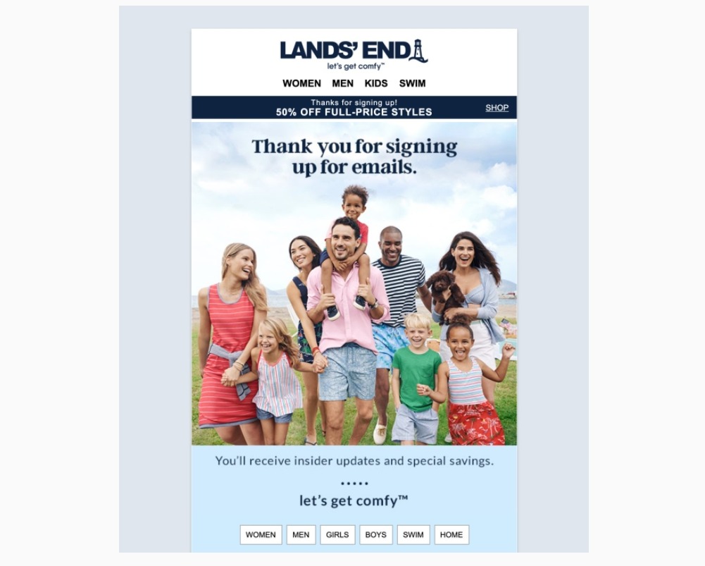
Land’s End is a well-known lifestyle brand that has made the move from catalogs to online sales. They don’t spend time with generic buttons that say “Shop now” or “Buy now” in their welcome email.
Instead, they get right to the point by leveraging various product web pages as CTA buttons. They’re increasing their conversion rates by putting their landing pages in front of you!
13. Coursera
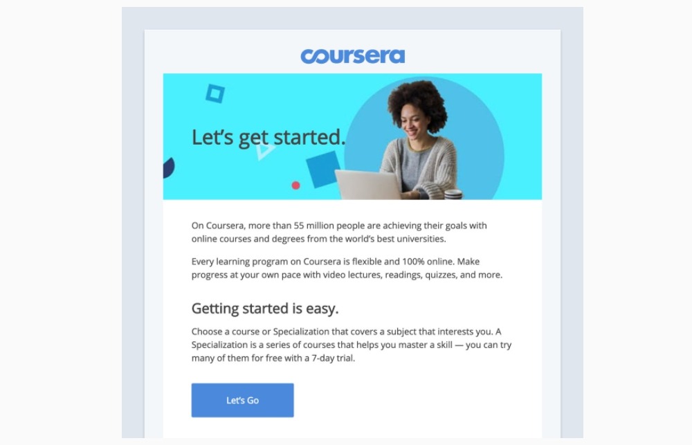
Many people have had success by incorporating arrows into their buttons. While this is an effective approach to focus readers’ attention to the button, it may also be distracting to the content. Another tactic is to utilize images that direct attention to the CTA.
Instead of staring straight at the camera, a person could be looking in the direction of the button. In their welcome email, Coursera gets it—just look at the smiling student’s gaze!
They also use it to complement their CTA button content. Which of the following would you prefer to be advised to do: “Let’s Go,” “Study Now,” or “Learn More”?
14. The North Face
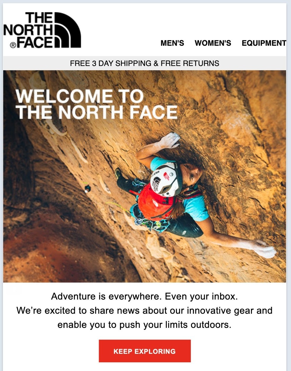
Examine your email design and select a button color that stands out. Ensure that the button color contrasts with the background and text colors. The goal is to make it look unified while keeping the CTA button the most prominent color on the screen.
With their welcome email, The North Face makes fantastic use of a contrasting color. Notice how the orange CTA button, along with the bag, leaps out from the email? Furthermore, their button text is fantastic!
Also, while this email is for their e-commerce portal, it’s not only about discount coupons and specials - it’s about getting ready for your next outdoor trip.
15. Airtable
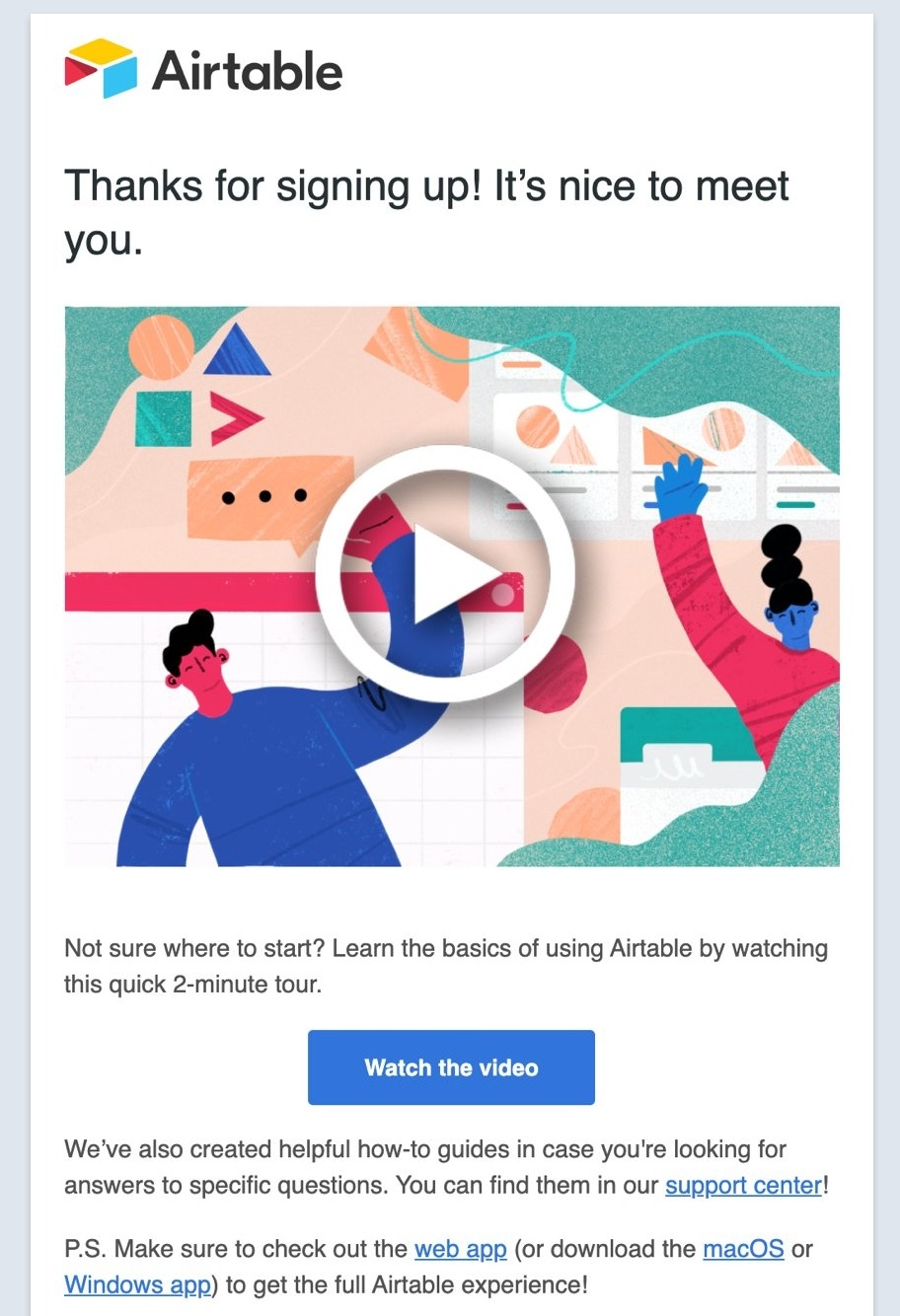
You don’t want the CTA to be distracting, but it also needs to be large enough to be found fast. Make an eye test and use your judgment. Are you able to locate the CTA button?
Airtable employs a sophisticated technique to direct your attention to their call-to-action button. The hourglass design directs your attention to the single CTA button. Thankfully, the graphic and the CTA button both take you to the same video.
16. Columbia
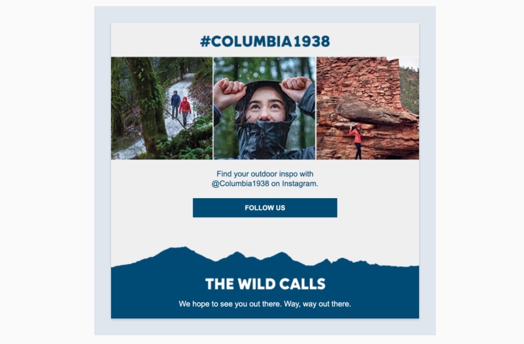
Remember that one size does not fit all—choose the proper CTA to bring your intriguing story to a satisfying conclusion.
Columbia, an outdoor sports business, peppers its message with the normal e-commerce CTA links. However, there is a social media CTA hidden underneath. Some clients aren’t in the market for anything right now. Allowing people to follow your brand is an excellent method to retain and develop them.
17. Another Escape
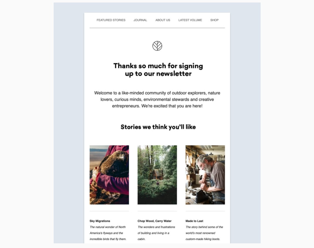
It’s not immediately obvious where the email CTAs are for Another Escape, a printed journal for outdoor enthusiasts. Their email allows you to search, click, and read at your own speed, in keeping with their exploration theme.
They deliberately avoided using distracting “Read more” links or buttons in their newsletter. Instead, their photographs are used as call-to-action buttons that direct you to an article of interest. It’s done well and fits in with their overall story.
18. Chubbies
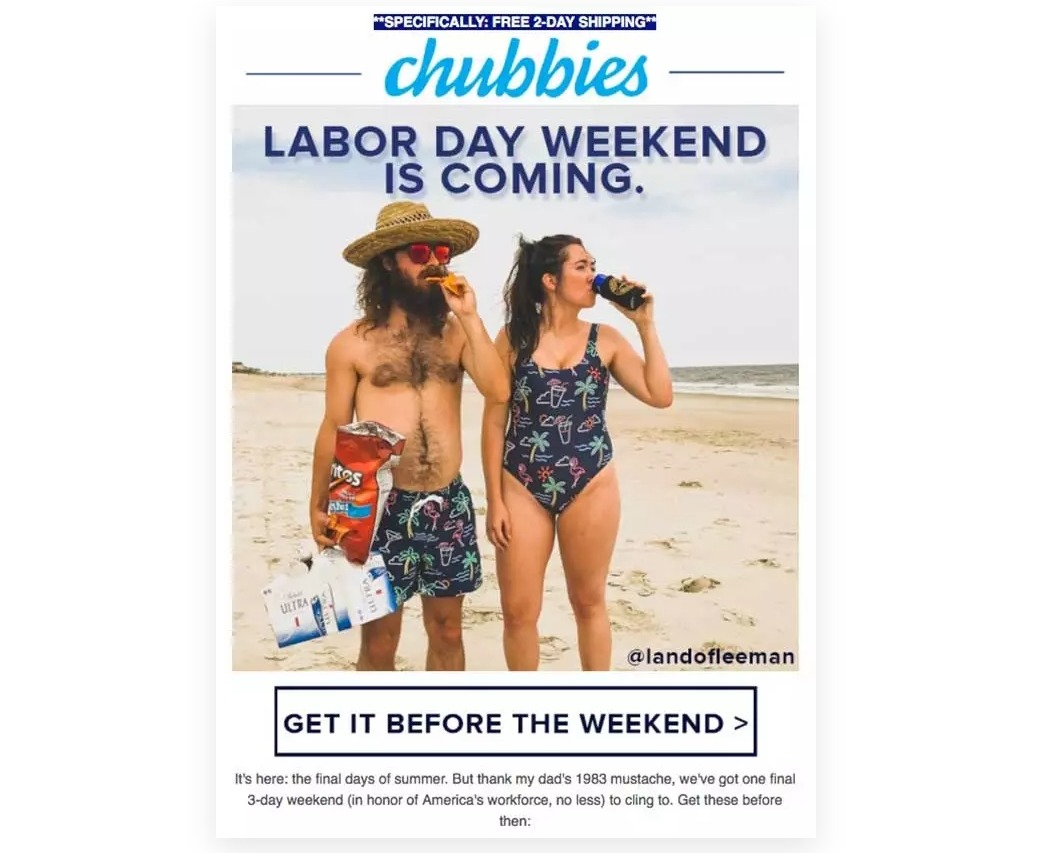
Each of your email’s CTAs should provoke a different emotion in your recipient. Chubbies, for example, uses people’s fear of missing out to induce them to click their CTA button.
This is a classic example of CTA in email that you as an eCommerce company can always use. The use of images in Chubbies’ email is humorous and laid back just like the brand itself, helping the CTA button to look even more tempting.
Final words
You may create emails that inspire your readers to take action quickly by using this wide selection of call to action examples.
It’s critical to think about the following questions while building an effective CTA:
-
Which CTAs, text or button, perform better?
-
Is there a difference in button color when it comes to CTAs?
-
What about CTAs in the email’s subject line? Are they as efficient as their promoters claim?
-
How much is too much when it comes to many CTAs? When do the returns start to plummet?
-
Is it possible to use the findings from landing-page CTA research to email CTAs?
If you are not sure how to answer these questions, the best approach is to try out email templates. AVADA Marketing Automation has many email templates with professional design and fantastic CTA, you just need to insert your copy. Best of all, our app is free to start using!
The benefit of email marketing is that they can be tested in many ways. You’ll be able to experiment and be creative by trying out different buttons and text possibilities by having a powerful app. Try it out today by clicking on the link below.


New Posts


How To Set Up Google Analytics 4 For Your BigCommerce Store
