
11 Best Mobile Email Marketing Practices for Higher Conversion
By Sam Nguyen

Drive 20-40% of your revenue with Avada
As a modern marketer, you know it’s vital to have an online presence and a strong email list. However, have you ever considered what your emails look like on mobile devices?
If the answer is no, you’re really missing out on a huge opportunity. This blog post will help you understand mobile email marketing: what it is, why you need it, and how to do it effectively.
Let’s explore!
What is mobile email marketing?
Simply put, mobile email marketing refers to the process of optimizing email marketing campaigns to become “mobile-first,” by adjusting text and design that fits mobile phone users.

The explosion of Android, iPhone, and tablet devices means businesses must adopt a “mobile-first” mentality or risk losing the opens, clicks, and conversions that deliver revenue back to the business. If you continue building your email marketing strategy for the desktop computer era, chances are your audience will never open or read your emails.
Why does your business need mobile email marketing?
Although mobile now reigns supreme, many email marketers have failed to adapt their content to this trend. That’s bad news, because mobile-optimized emails are essential for retaining subscribers.
A whopping 80% of subscribers will simply delete an email if it doesn’t show up well on mobile devices, and 30% will go so far as to unsubscribe after opening a single email that doesn’t look great on their mobile device.
The takeaway? Unless you optimize your emails for mobile, you are actively driving away potential customers and harming your conversion rates. So, it’s essential for marketers of all stripes to employ best practices for email marketing on mobile. Below is how to make it happen.
11 best practices to optimize your emails for mobile
1. Write a short subject line
There has been quite a bit written about the art and science of email subject lines, and all of these best practices still apply on mobile. And instead of encouraging you to read hundreds of thousands of articles on this subject, check out our guide on how to write best subject lines for a comprehensive overview.
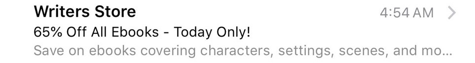
When mentioning the length of the subject lines, the common advice is to keep them short.
But when you are thinking mobile-first, keep them even shorter.
People use a lot of different phones, size screens, font sizes, and email clients. So, it’s best to keep your email subject lines at 35 characters or less.
Below is an example of a tight, 32-character email subject line that comfortably squeezes in an offer and sense of urgency.
Related content:
- The Guide for Email Subject Line Testing
- 99 Tempting Email Subject Lines for Spring Season
- 33 Holiday Email Subject Lines and Most Favored Emojis
- 33+ Best Thanksgiving Email Subject Lines
- 32+ Best Halloween Email Subject Lines
2. Pay attention to your pre-header text
When it comes to email best practices, the focus is often placed on subject lines. Meanwhile, the pre-header text is usually overlooked, although it’s equally important!
The pre-header text refers to the first line of your email text that is visible as a preview in a user’s email client. It’s an invaluable companion to your subject line and provides precious extra characters that can be used to incentivize your recipients to click.

Because pre-header text length often varies based on the email client and device being used, it is essential to keep it short, punchy, and easy to consume. In the same way that you can A/B test subject lines, you can also A/B test pre-header text, and then tailor it to different target audience segments, their preferences, the email clients, and devices they are using.
There are many approaches you can take to optimize the impact of your pre-header text. One is to make your email subject line and pre-header text one connected message. That means you have more space to put your messaging into context, or it can even include a deeper level of details, such as price points and percentage discounts.
Personalization is vital to email marketing success - marketers are always encouraged to implement it within their copy, and sometimes within their email subject lines to increase conversion. However, what about pre-header text? You should tailor your pre-header text to add a more personal touch, and you might stand a better chance of boosting your click-throughs.
3. Keep your “From:” field even shorter
Your recipients should be aware of the brand that is sending them the emails, so you should ensure that the “From:” field is a trustworthy one and properly highlighted.
IBM Marketing Cloud points out that the sender name has become more important than ever because “People aren’t less interested in email, they are simply spending less time on irrelevant emails.”
With so many emails rapidly filling up people’s email inboxes daily, people are more likely to scan first the “From” field and then the subject line. In addition, junk mail filters have become less forgiving, and people can easily relegate any email sender who isn’t in their contacts to the spam folder.
Here are a few optimization tips for the “From” name:
- Use the brand name or personal name that recipients would be sure to recognize.
- Use different “From” names for various newsletter subscriptions, but ensure they’re still consistent within your brand. For example, Delta Air Lines uses “Delta Air Lines” for promotional and frequent flyer emails, while using “Delta Messenger” for flight-related messages (i.e., check-in reminders).
- Test different “From” names if you are not sure which one is the most effective name.
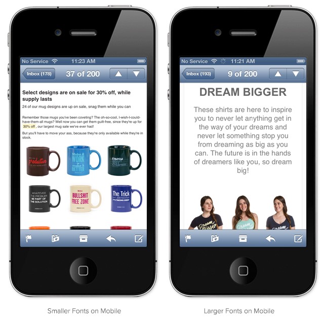
4. Use a large font
Tiny text on a small screen is a nightmare to read.
We recommend 14px as a minimum size for body copy and 22px for your headlines. Plus, note that iOS will automatically resize fonts under 13px, which makes them larger on your behalf.
You can realize how much enlarging fonts help in the two emails below. Because of Company A’s tiny font (image on the left), it’s difficult to read the text on the small screen of mobile devices. Nevertheless, company B (image on the right) uses much larger fonts, which allows recipients to easily read the email without zooming in.
5. Stick with a one-column layout
If you’ve ever read our post 11 Email Design Best Practices for Marketers, you’ll know that mobile-friendly emails should consider switching to a one-column layout. This approach well accommodates smaller screens and can help increase legibility.
For example, Onsen does this well, using a single-column layout to feature striking imagery and prominent testimonials.
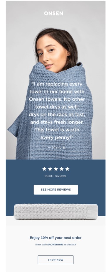
This quote compels people to scroll further down in the email, where they can look at other reviews or access a 10% discount.
6. Create short yet compelling copy
The shorter your email is, the easier it is to read on a mobile device. Actually, the ideal length for email copy is between 50 and 125 words.
But before writing an email copy that converts, you should find out the “motivational factor” that can persuade the reader to take action. Assume that you’re the customer and start thinking from their point of view:
- Who’s sending me the message?
- Why are they sending me this message?
- Do I actually need their products or services?
- When do I need it?
- Can I trust them?
Additionally, below are some helpful tips to get started:
- Always match your subject line with email copy (click-bait may work once, but only once)
- If you make a promise, don’t break it!
- Make sure to sound genuine and trustworthy, so don’t overly promote your products/ services
- Be consistent in your messaging
- Match your target landing page cohesively
- Take advantage of powerful action words, such as “act,” “get,” “join,” “grab,” “build,” “celebrate,” “activate,” etc. so that it motivates the readers to click on your CTA
- Keep your main points bulleted
- Bold important words, and underline or italicize action words
- Make your email body easy to scan
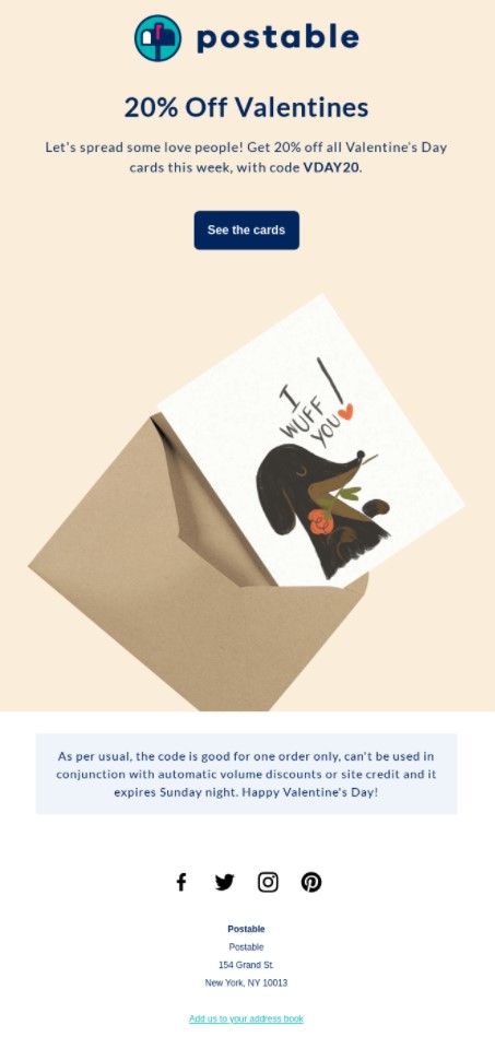
This email from Postable does a great job of conveying the value of its products in just a handful of words:
7. Optimize your images
An image is an integral component of a successful email marketing campaign, and especially essential for mobile devices.
By making sure that you have properly optimized images, you can maintain fast page load speeds, which ultimately enhances user experience and SEO, while you’ll keep your storage space and bandwidth costs down.
Some tips to optimize your images include:
-
Reduce your image size without reducing the quality. Mobile phones often use slower connections, meaning that large images take a long time to load. Many users also have data limits. Hence, a good rule of thumb is to shrink your image by 50% and compress it at a slightly higher compression rate. This will save both time and data.
-
Automatically adjust the width of the image as per the screen size
-
Your images should support the main email text
-
Don’t forget to add alt text
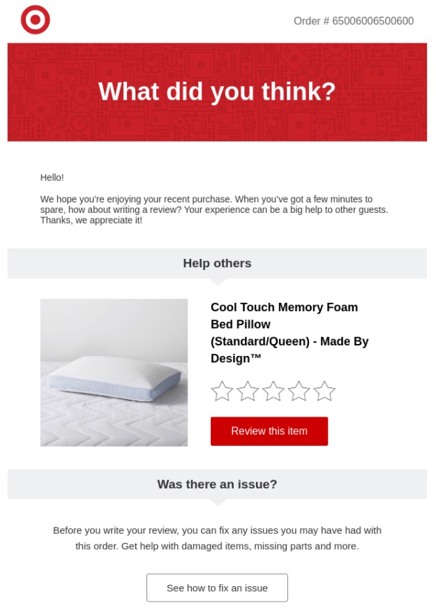
8. Increase white space
One danger of viewing content on small screens is that it often appears cluttered. You can actually use white space to minimize this.
Increase the margins of your emails, add extra spacing between lines and paragraphs, as well as leave space between text and images. This makes it much easier for people to understand where they are supposed to look.
For an example of what this might look like practice, have a look at this email from Target:
9. Make the most of the CTA buttons
When it comes to reading emails on mobile phones, your CTA buttons should be touch-friendly. We recommend putting your CTA front-and-center and, if you are using a button, make it a minimum size of 44 x 44pxls.
In mobile-friendly emails, it is best to bring your CTAs as far up within the copy as possible, while limiting the amount of copy used, as text-heavy emails often don’t perform well on mobile.
It is also recommended to use buttons instead of links. This is mainly because hyperlinks, much like excessive amounts of text, don’t make the most of an email’s mobile-responsive design. Buttons are much more distinctive and easier to click on when using a mobile device.
You can optimize your CTA buttons by limiting the number of words used and making sure that you utilize action verbs that work as an additional encouragement to click. Some phrases, such as “Find out more,” “Download now,” “Get exclusive access,” or “Shop the collection” lead people in the right direction by providing them information about where their next action will take them. Using words like “now” and “today” helps create a sense of urgency by intimating that your product/ service availability is limited.
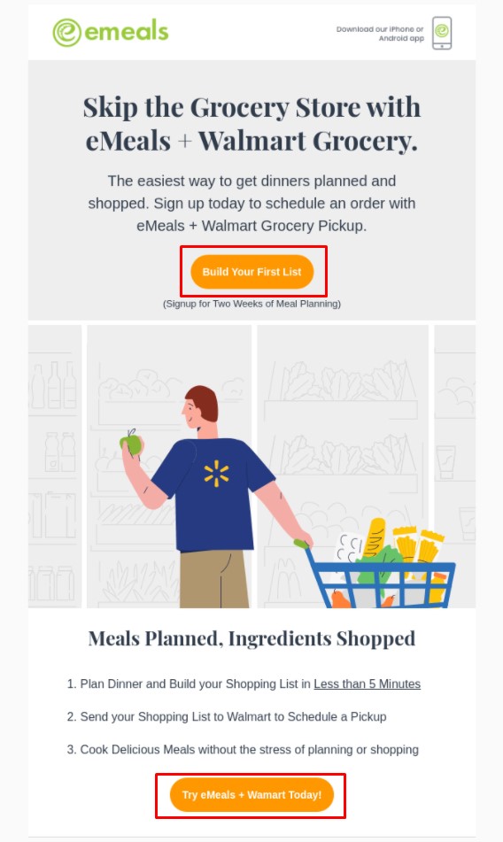
For example, Emeals does a good job of this, including CTA buttons at both the top and the bottom of its emails.
10. Time your emails around people’s phone habits
People check emails on their phones at different times than on their computers. Therefore, with a mobile-oriented email strategy, you will want to take advantage of these less traditional times.
-
Late morning. Studies found that people are most likely to check emails on their mobile phones in the late morning. So, try timing out your sends at 10-11 a.m, which should put them at the top of your recipients’ inboxes during their prime email checking time.
-
At night. Lots of people open emails between 8 p.m and midnight. There is also less competition from work emails at that hour, so there is a better chance your message will stand out in your recipients’ inboxes. This timing is especially appropriate if your target customer is younger; two-thirds of millennials do the in-bed phone check move.
Of course, when to send marketing emails widely varies by customer base and industry/ So, testing and experimentation are essential to figure out when your particular audience is checking emails and clicking through to buy.
11. Preview and test your emails
After you have worked hard to create a beautiful email for mobile viewing, remember to view it yourself to make sure it turned out the way you’d hoped.
In addition to previewing your emails in various email clients, testing them on multiple devices helps ensure the layout is preserved. Most email marketing platforms include a previewing function in which you can pick which email clients and devices to test out.
The same applies to the landing pages you link to from your CTA. Test these pages on mobile devices and ensure the text and any links are “finger-friendly.”
The bottom line
With more and more people viewing emails on mobile devices, you don’t want your emails deleted just because they are not optimized for mobile users. More importantly, you want them to fulfill their intended purpose - getting opens, click-throughs, and ultimately conversions.
We hope through this blog post, you can build a solid mobile email marketing campaign. Feel free to contact us if you have any concerns about this topic. Thanks for reading!


New Posts


How To Set Up Google Analytics 4 For Your BigCommerce Store
